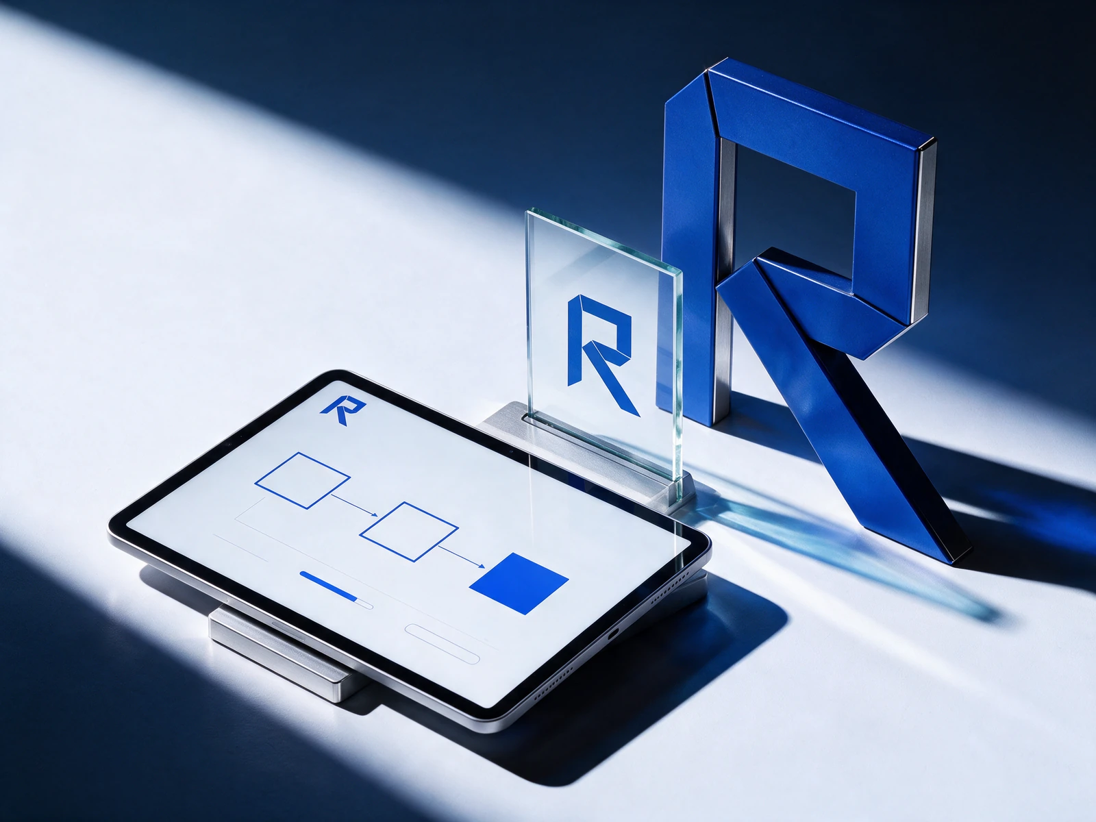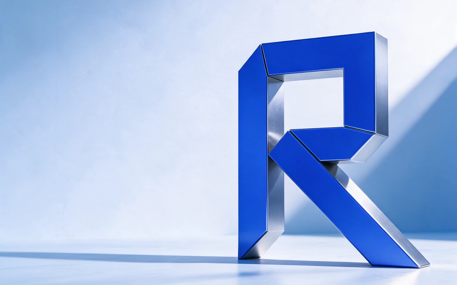
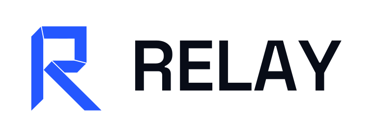
A folded R becomes a forward-moving signal. Electric cobalt and a disciplined grid bring clarity to a complex product category.
A fictional studio exploration showing how one idea connects strategy, identity, applications, and a digital experience.
The folded form pairs a stable upright with a diagonal route. It reads as an initial at a glance and suggests a handoff in motion. Repeated folds create a visual language that can extend beyond the logo.
Use the supplied vector master for print and large-format work. Use the transparent PNG for slides and digital applications. Keep clear space around the mark equal to at least one-quarter of its height. Do not stretch, rotate, outline, or add effects.
Keep the color mark on a light, quiet background. Use the supplied white symbol PNG for dark applications.
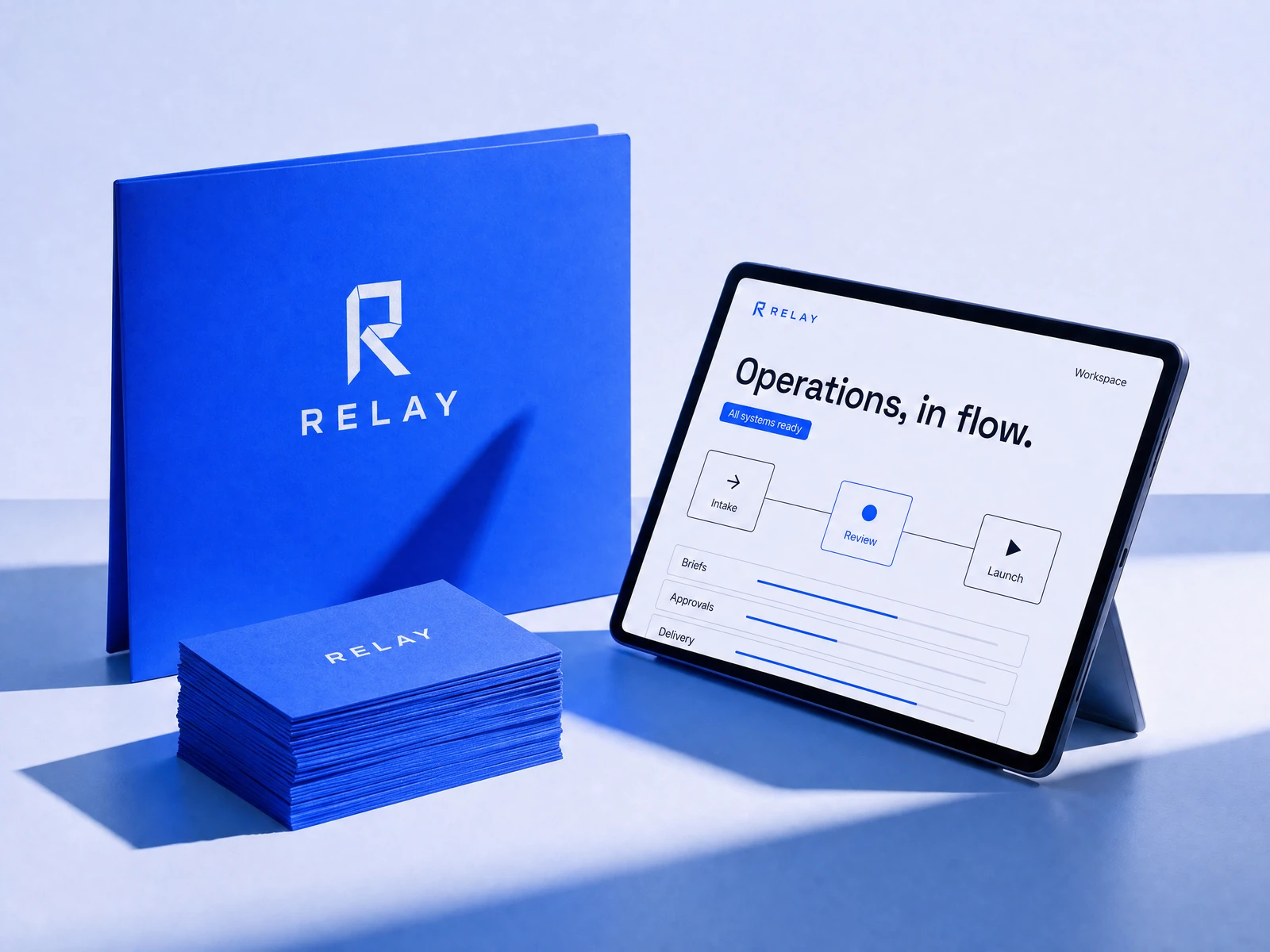
Signal blue carries recognition and action. Midnight gives the system structure, while Ice creates room for complex information. The strongest color is saved for the moments that deserve attention.
Use the light tone for space, the dark tone for structure, and the accent with purpose. Hex values are screen references; confirm production print colors with your printer. Check contrast when applying small type.
Clarity for systems in motion.
Space Grotesk brings a technical character to headlines. Inter keeps navigation, labels, and dense product information easy to scan. Short labels and a disciplined hierarchy turn the identity into a useful interface. Use a small number of sizes, generous spacing, and a consistent hierarchy. Font files and open font licenses are included.


Generated application imagery is an art-direction study. Exact production logos and color values are supplied separately in the vector and token files.