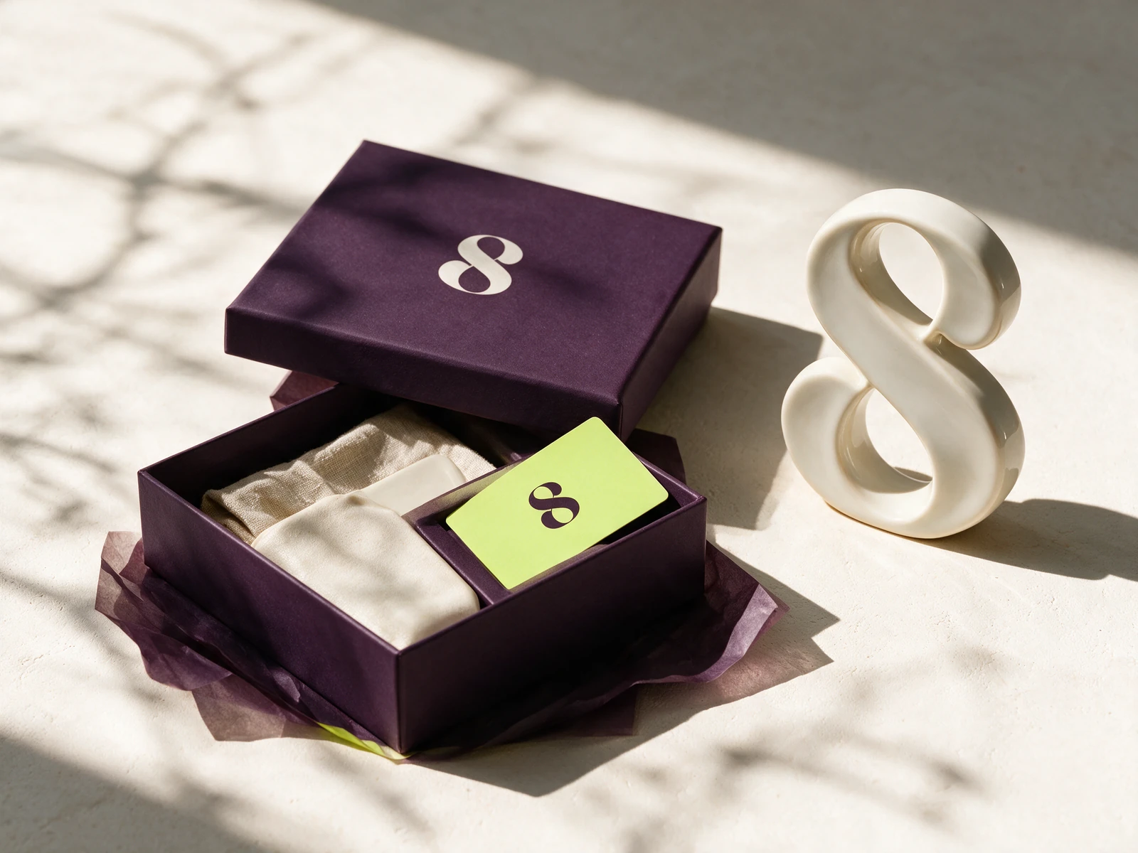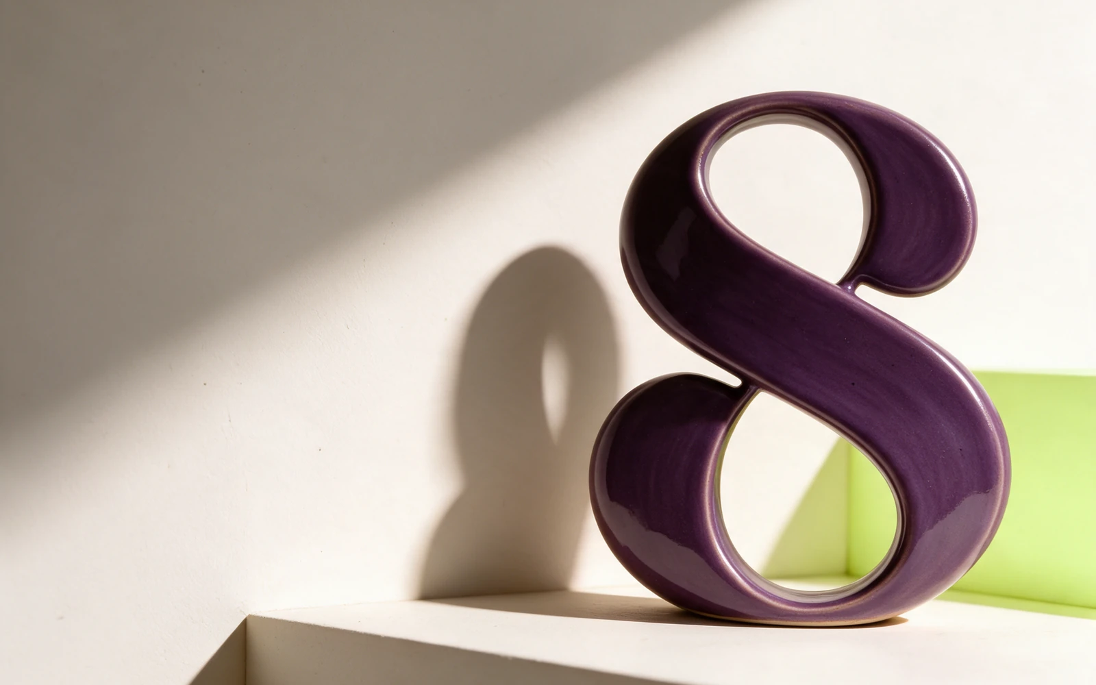
A flowing S connects strength and restoration. Aubergine gives the identity depth, while lime adds an unexpected moment of lightness.
A fictional studio exploration showing how one idea connects strategy, identity, applications, and a digital experience.
The S turns through a continuous, ribbon-like curve. Its open and closed spaces suggest stretching, returning, and finding balance. The silhouette stays expressive enough to become a small signature on a membership card or tote.
Use the supplied vector master for print and large-format work. Use the transparent PNG for slides and digital applications. Keep clear space around the mark equal to at least one-quarter of its height. Do not stretch, rotate, outline, or add effects.
Use the color symbol on Porcelain. Its counters contain Porcelain fills. For dark backgrounds use the supplied white symbol PNG.
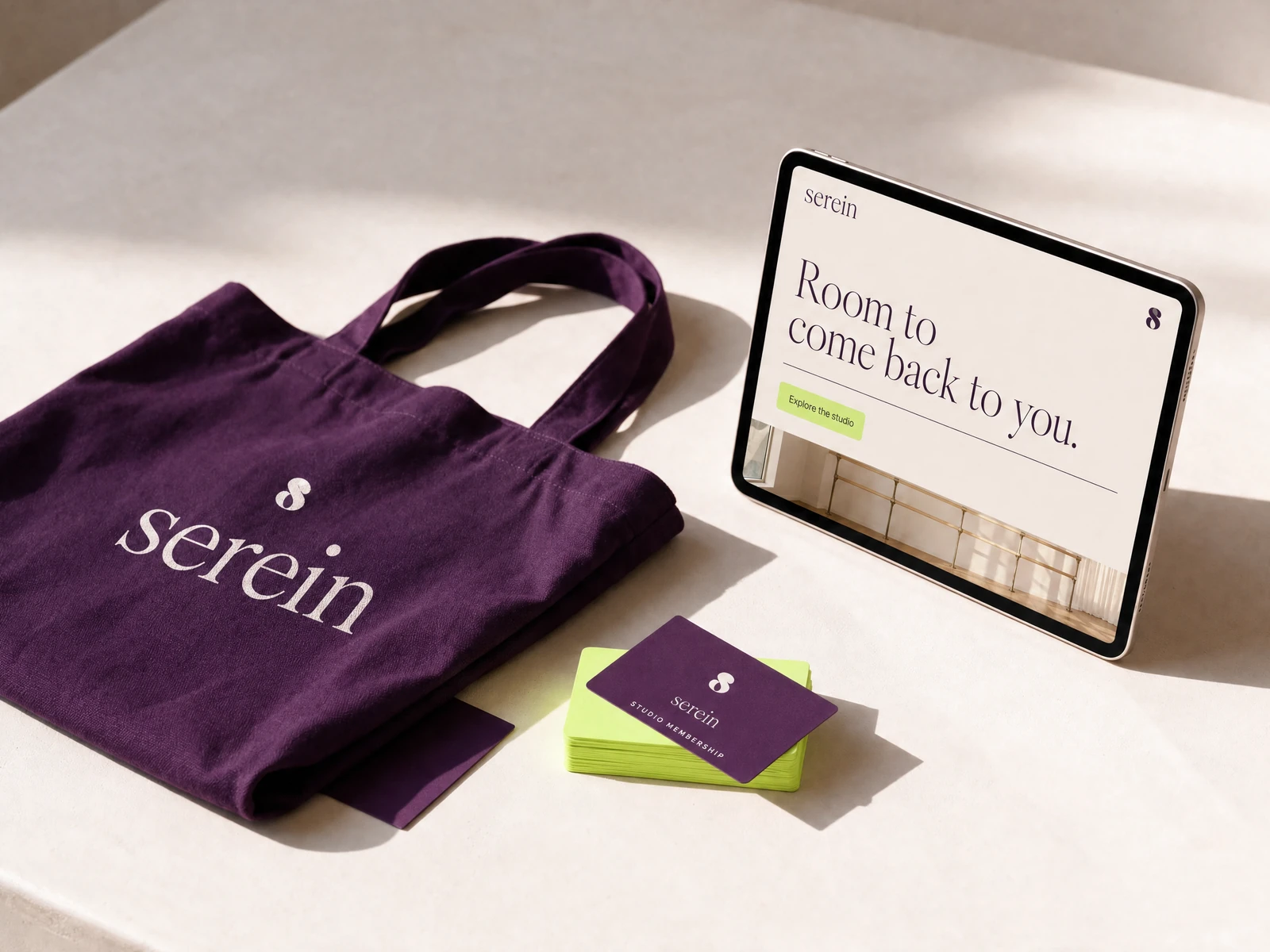
Aubergine gives the identity depth. Porcelain lets it breathe. A fresh lime accent brings energy to the moments of participation: a membership card, a class, a new beginning.
Use the light tone for space, the dark tone for structure, and the accent with purpose. Hex values are screen references; confirm production print colors with your printer. Check contrast when applying small type.
Find your own rhythm.
Instrument Serif italic gives the brand its expressive rhythm. Inter brings clarity to class times, navigation, and useful details. That contrast lets the atmosphere feel gentle while the experience stays easy to use. Use a small number of sizes, generous spacing, and a consistent hierarchy. Font files and open font licenses are included.


Generated application imagery is an art-direction study. Exact production logos and color values are supplied separately in the vector and token files.