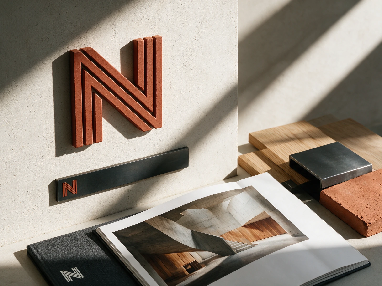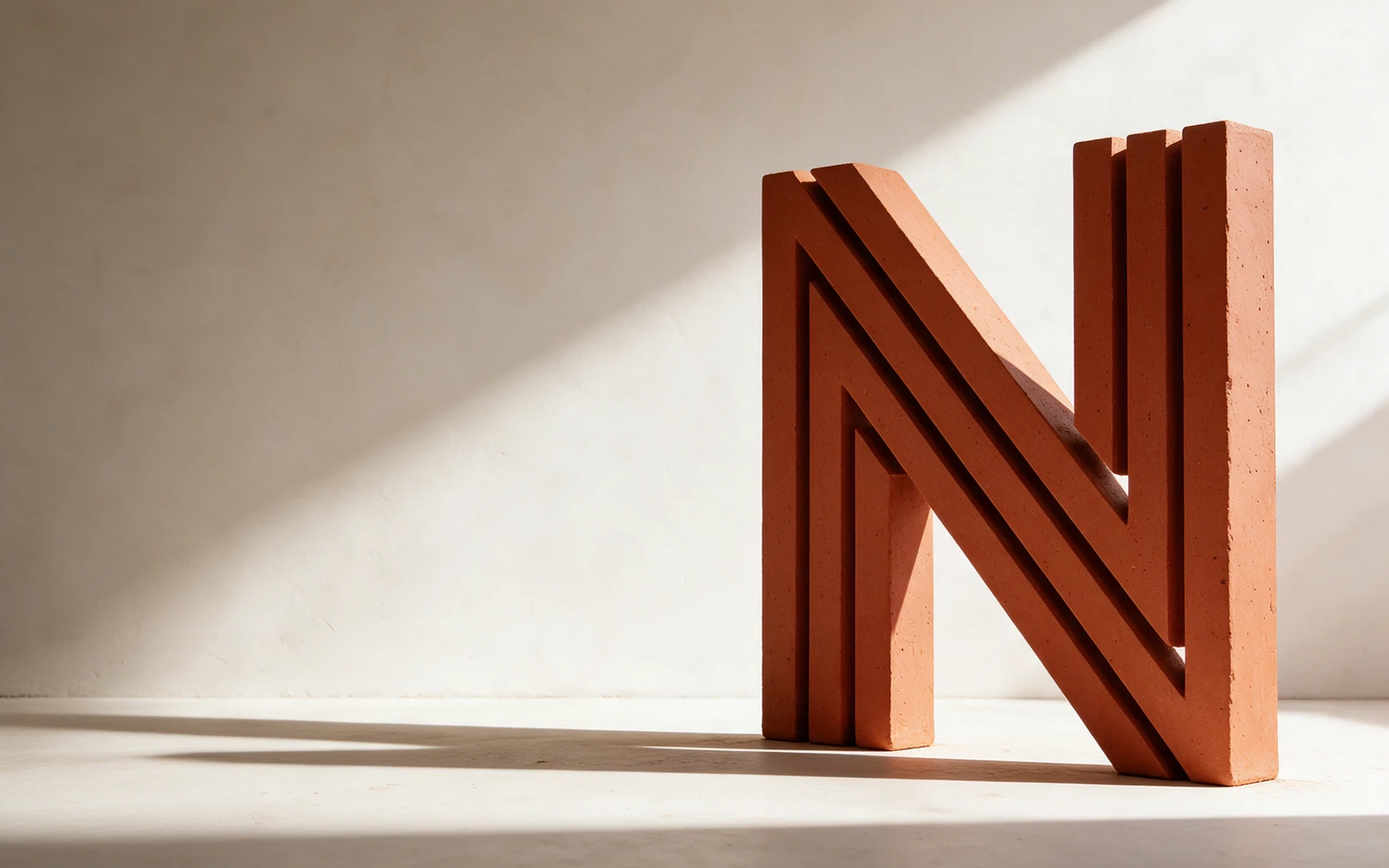
Parallel structural lines form an N. Plaster, charcoal, and rust connect an architectural grid to the warmth of physical materials.
A fictional studio exploration showing how one idea connects strategy, identity, applications, and a digital experience.
Parallel lines form an N with the rhythm of beams and an architectural drawing. Repetition gives the mark depth without adding decoration. It translates naturally into an embossed folio or a restrained editorial signature.
Use the supplied vector master for print and large-format work. Use the transparent PNG for slides and digital applications. Keep clear space around the mark equal to at least one-quarter of its height. Do not stretch, rotate, outline, or add effects.
Keep the color mark on a light, quiet background. Use the supplied white symbol PNG for dark applications.
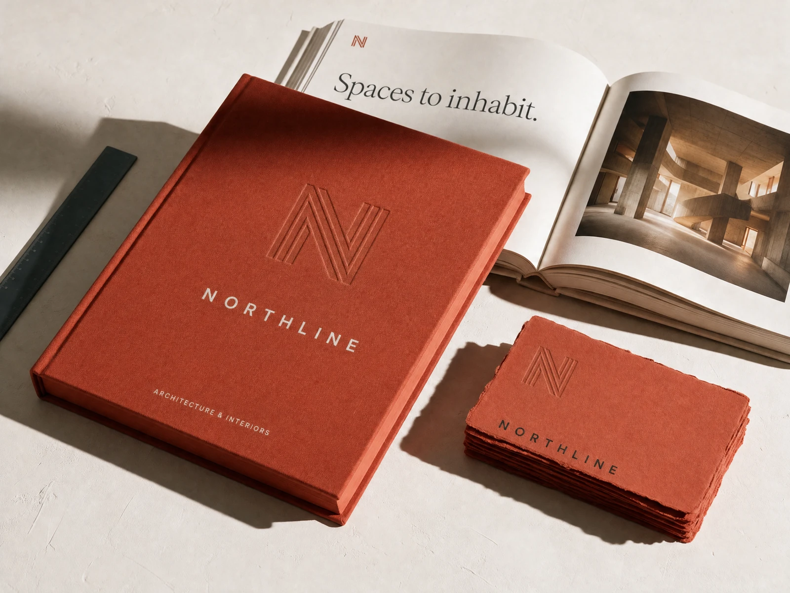
Plaster provides the quiet ground. Graphite defines the structure. Terracotta connects the identity to clay, brick, and the warmth of physical materials. Together, the palette feels architectural without becoming cold.
Use the light tone for space, the dark tone for structure, and the accent with purpose. Hex values are screen references; confirm production print colors with your printer. Check contrast when applying small type.
Built around how we live.
Inter gives the system a clear, measured foundation. Occasional Instrument Serif phrases introduce warmth. Generous margins, concise project labels, and deliberate alignment allow the architecture to remain the subject. Use a small number of sizes, generous spacing, and a consistent hierarchy. Font files and open font licenses are included.


Generated application imagery is an art-direction study. Exact production logos and color values are supplied separately in the vector and token files.