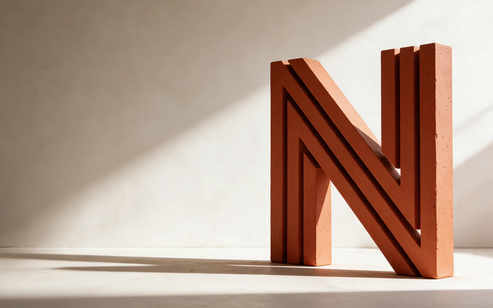
Built around how we live.
An identity and editorial website direction for a fictional architecture studio creating quiet spaces with enduring materials.
Parallel structural lines form an N, echoing the precision of an architectural drawing. A material palette of plaster, charcoal, and rust gives the system warmth; generous space lets the work speak.
The thinking
inside the feeling.
The direction imagines an architecture practice defined by proportion, material honesty, and quiet spaces. The identity follows those same principles, giving the studio a presence that feels measured and enduring.

ROOM TO ADAPT.
01 / THE SYMBOLDrawn from the structure.
Parallel lines form an N with the rhythm of beams and an architectural drawing. Repetition gives the mark depth without adding decoration. It translates naturally into an embossed folio or a restrained editorial signature.
02 / THE TYPOGRAPHYSpace is part of the identity.
Inter gives the system a clear, measured foundation. Occasional Instrument Serif phrases introduce warmth. Generous margins, concise project labels, and deliberate alignment allow the architecture to remain the subject.
03 / THE PALETTEColor with material memory.
Plaster provides the quiet ground. Graphite defines the structure. Terracotta connects the identity to clay, brick, and the warmth of physical materials. Together, the palette feels architectural without becoming cold.
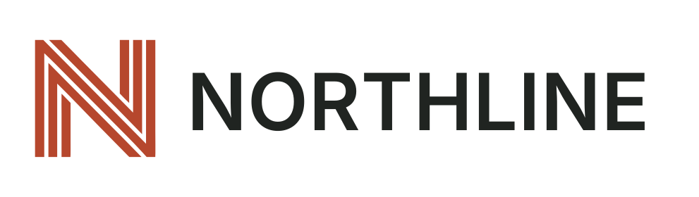 THE SIGNATURE / PRIMARY LOCKUP
Built around how we live.
 ONE IDEA. EVERY EXPRESSION.
The same care, from the printed page to the built environment.
Blind embossing, warm paper, and a restrained project presentation create a material expression of the studio’s point of view.
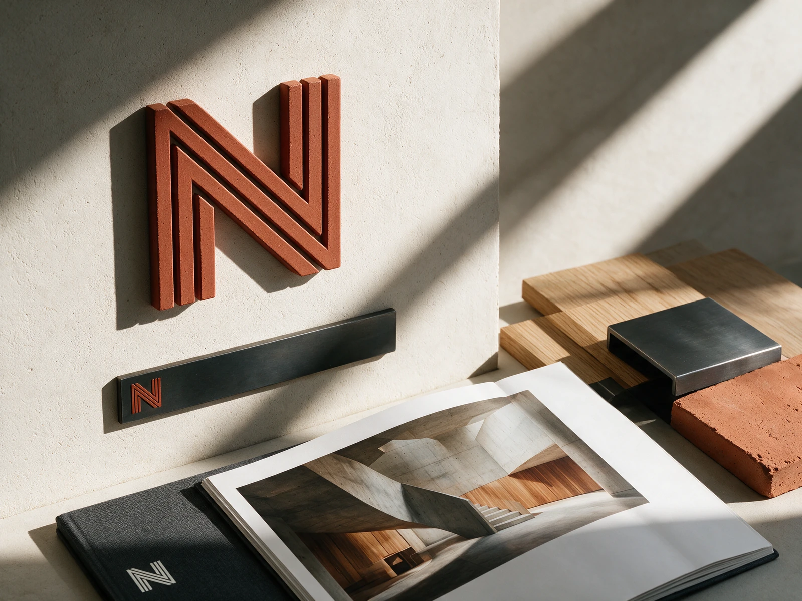
An identity with a material point of view.
Parallel structural lines form an N, echoing the precision of an architectural drawing. A material palette of plaster, charcoal, and rust gives the system warmth; generous space lets the work speak.
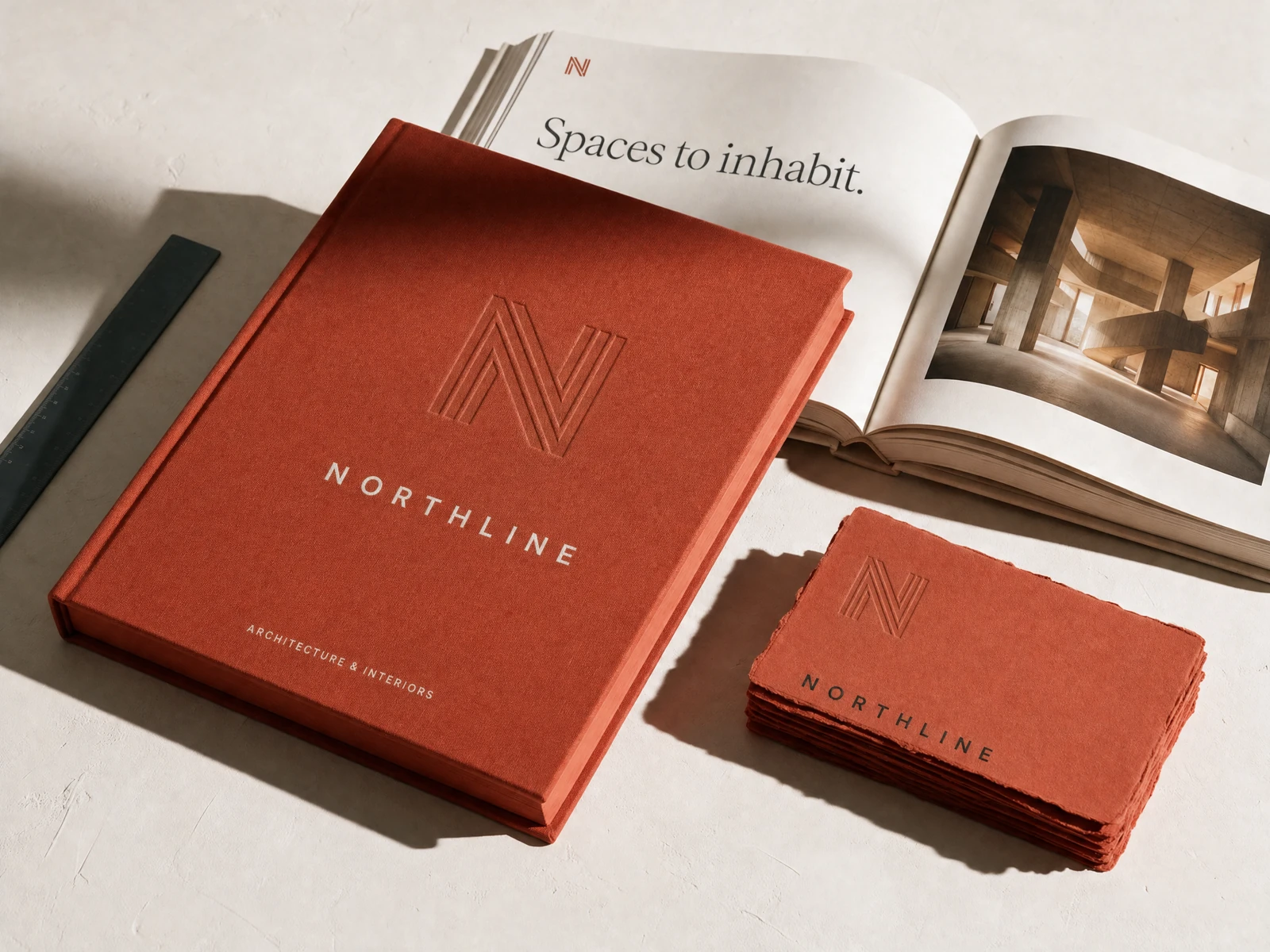
A feeling.
Made functional.
An editorial experience built on proportion, restraint, and an unmistakable point of view.
A quieter
point of view.
Considered spaces. Enduring materials.
Architecture that makes room for life.
Built to
belong together.
A usable identity system: a signature, a distinctive palette, a clear typographic voice, and the files to bring it to life.
Considered by nature.
Inter / Instrument Serif
A clear hierarchy. Room to breathe.
Everything starts with a system.
SVG logos · PNG exports · Color tokens · Identity guide
Concept assets for portfolio presentation and evaluation.
Your next chapter.
Let’s make it matter.
20 minutes. Free. Three written observations.