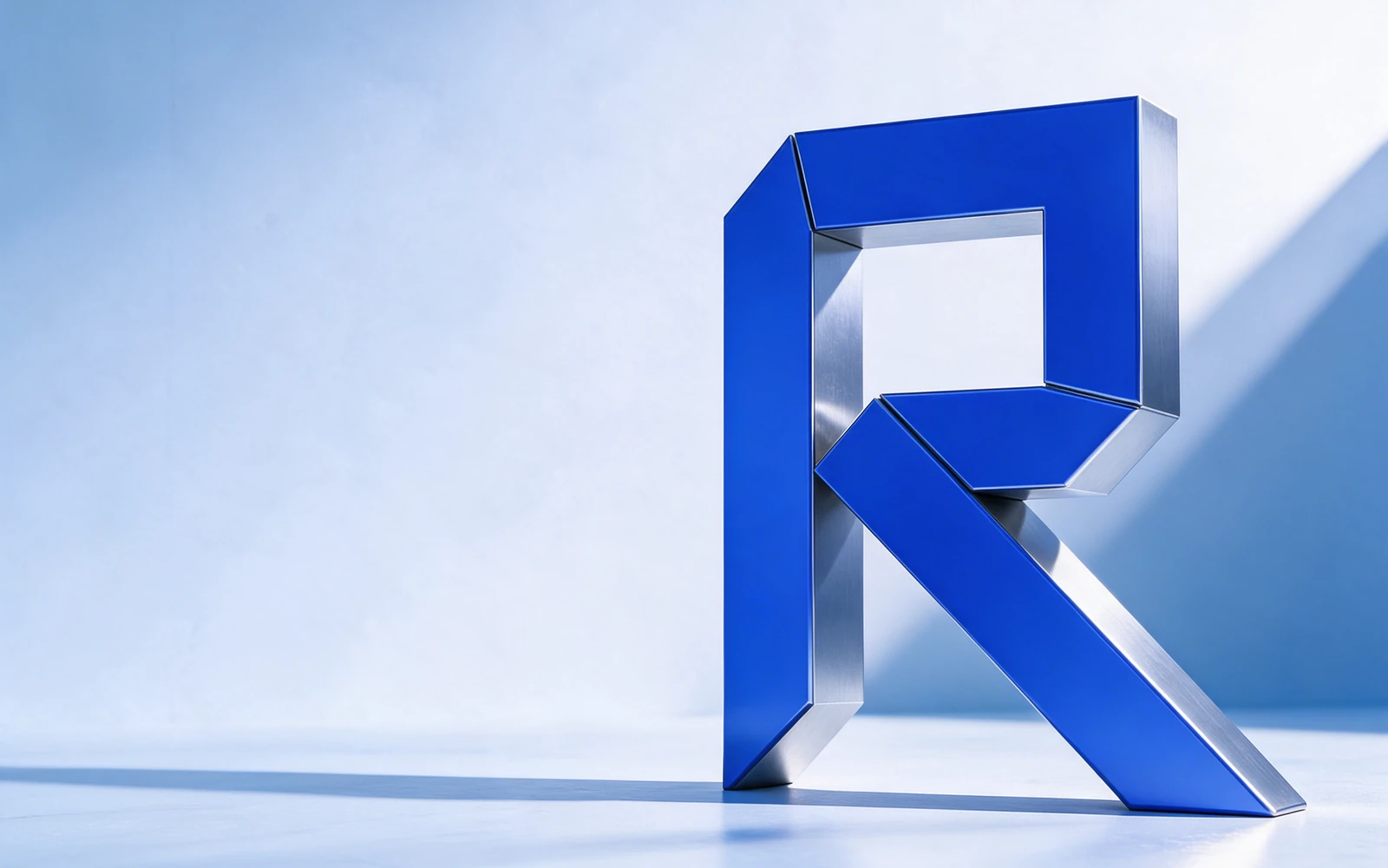
Clarity for systems in motion.
An identity and product language for a fictional AI operations platform that brings workflows, agents, and approvals into one clear view.
A folded R becomes a signal moving forward. Electric blue adds energy; a disciplined grid makes the complicated feel considered. The same logic connects the mark, the interface, and every touchpoint.
The thinking
inside the feeling.
AI operations can be difficult to see and harder to explain. The direction gives a technical product a recognizable signal, then carries that clarity into every interface and application.
ROOM TO ADAPT.
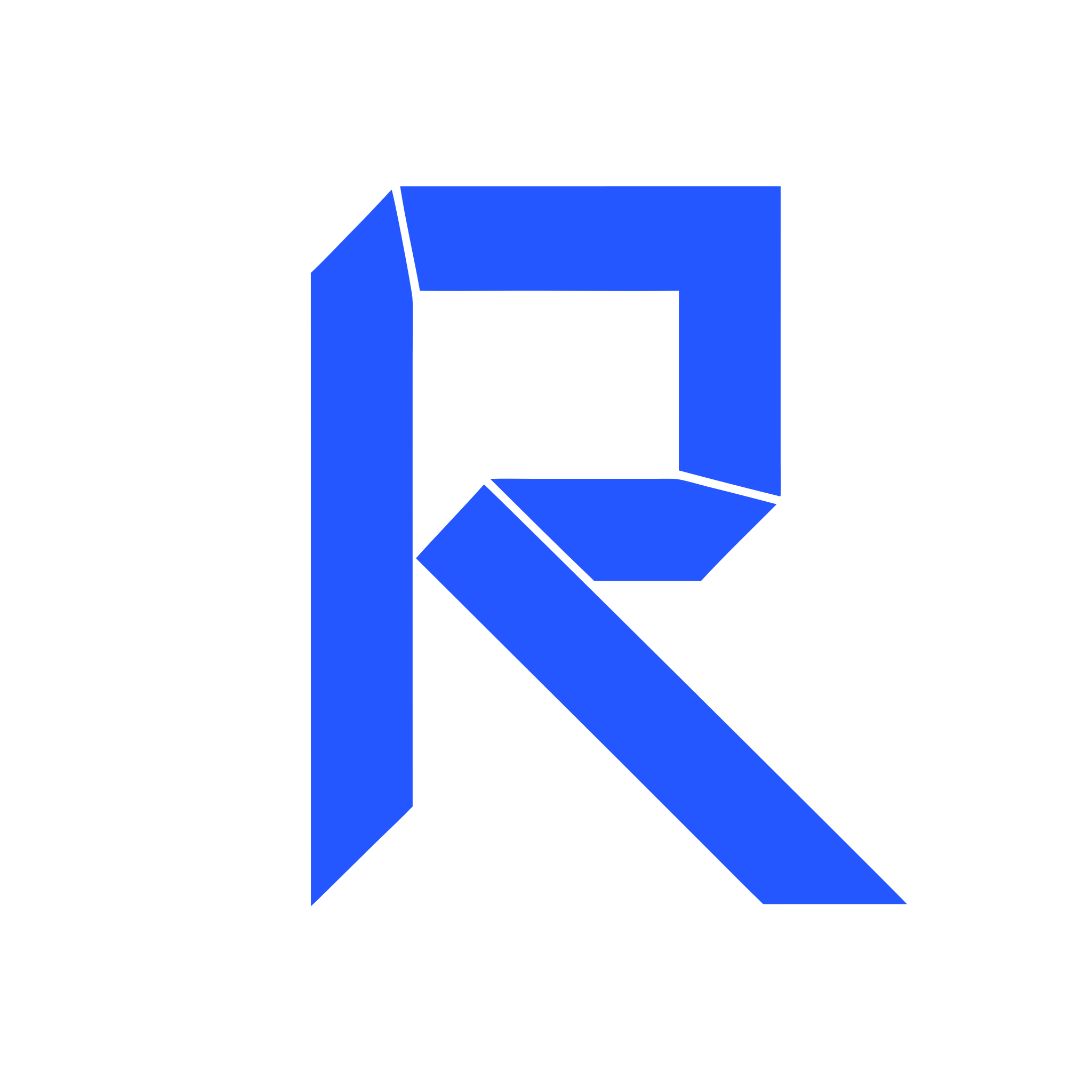
01 / THE SYMBOLAn R that carries momentum.
The folded form pairs a stable upright with a diagonal route. It reads as an initial at a glance and suggests a handoff in motion. Repeated folds create a visual language that can extend beyond the logo.
02 / THE TYPOGRAPHYClarity comes first.
Space Grotesk brings a technical character to headlines. Inter keeps navigation, labels, and dense product information easy to scan. Short labels and a disciplined hierarchy turn the identity into a useful interface.
03 / THE PALETTEA deliberate point of focus.
Signal blue carries recognition and action. Midnight gives the system structure, while Ice creates room for complex information. The strongest color is saved for the moments that deserve attention.
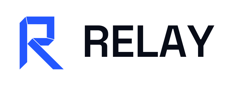 THE SIGNATURE / PRIMARY LOCKUP
Clarity for systems in motion.
 ONE IDEA. EVERY EXPRESSION.
From the first introduction to the daily workflow, the same signal holds the experience together.
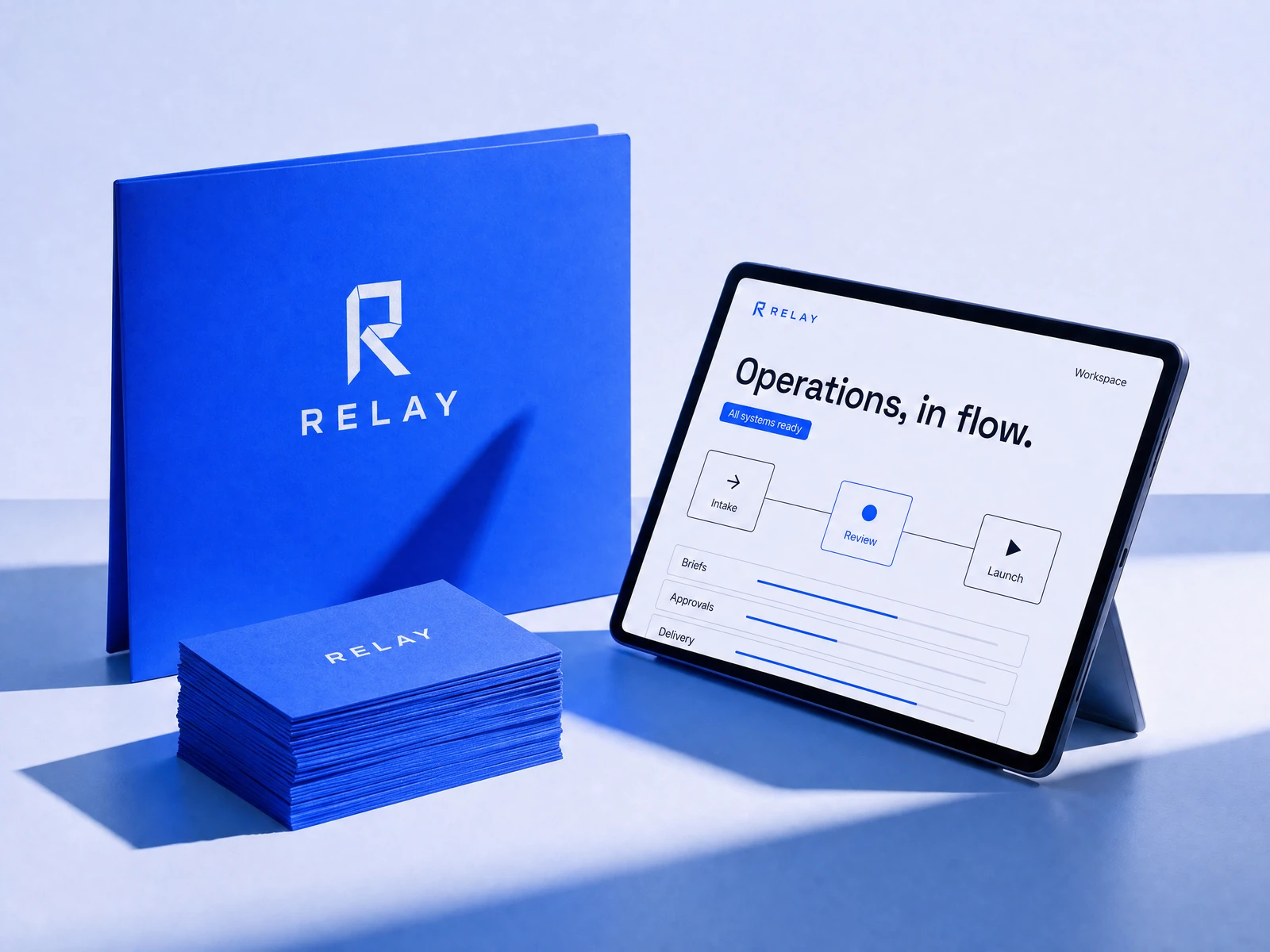
Cobalt print materials, a compact signature, and a composed product interface express the same idea at different scales.
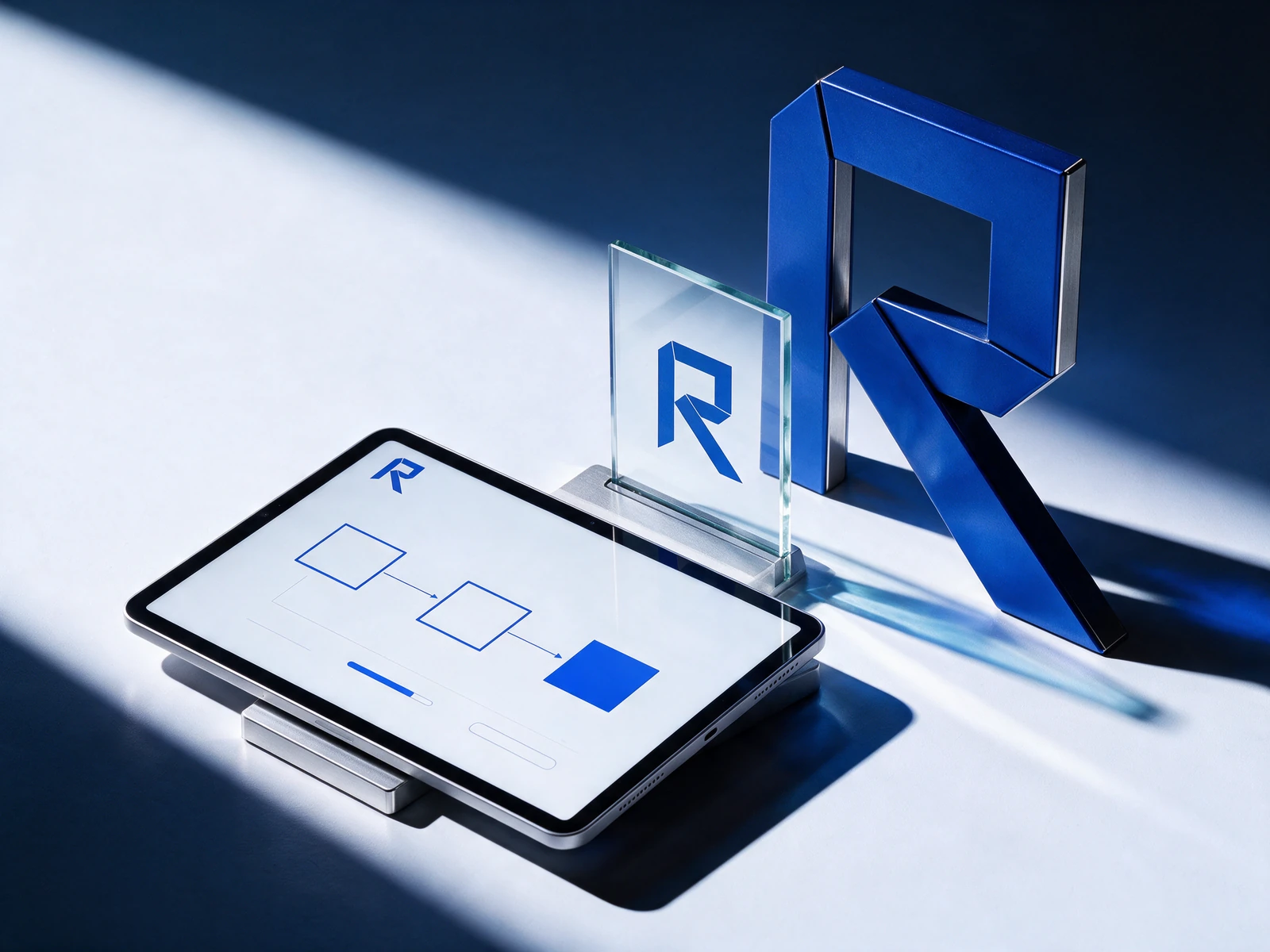
A signal that carries from identity into product.
A folded R becomes a signal moving forward. Electric blue adds energy; a disciplined grid makes the complicated feel considered. The same logic connects the mark, the interface, and every touchpoint.
A feeling.
Made functional.
A composed workspace that makes busy operations feel manageable. Try the navigation to explore the interface.
A clear view. A better flow.
Make space for the decisions that matter.
Built to
belong together.
A usable identity system: a signature, a distinctive palette, a clear typographic voice, and the files to bring it to life.
Move forward. Together.
Space Grotesk / Inter
A clear hierarchy. Room to breathe.
Everything starts with a system.
SVG logos · PNG exports · Color tokens · Identity guide
Concept assets for portfolio presentation and evaluation.
Your next chapter.
Let’s make it matter.
20 minutes. Free. Three written observations.