An idea earns its place when the details hold together. Explore identities, products and commerce — with the thinking, the scope and the kind of work clearly in view.
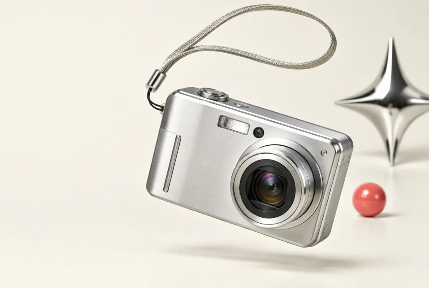
Warm ivory, coral and an irreverent chrome accent give restored cameras a world of their own. The commerce experience makes room for the condition, character and details of each product.
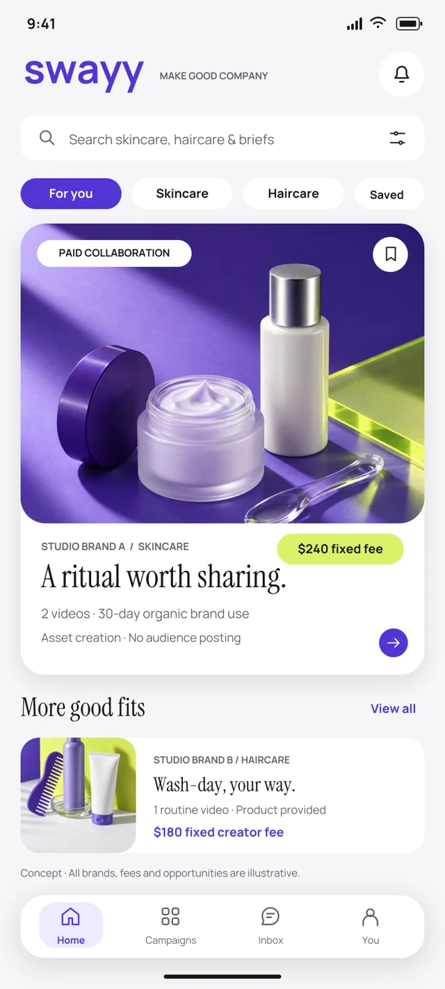
Violet creates recognition. Citron gives the important moments a little energy. A folded symbol carries that personality from the brand into a proposed creator marketplace.
A folded R becomes a signal moving forward. Electric blue adds energy; a disciplined grid makes the complicated feel considered. The same logic connects the mark, the interface, and every touchpoint.
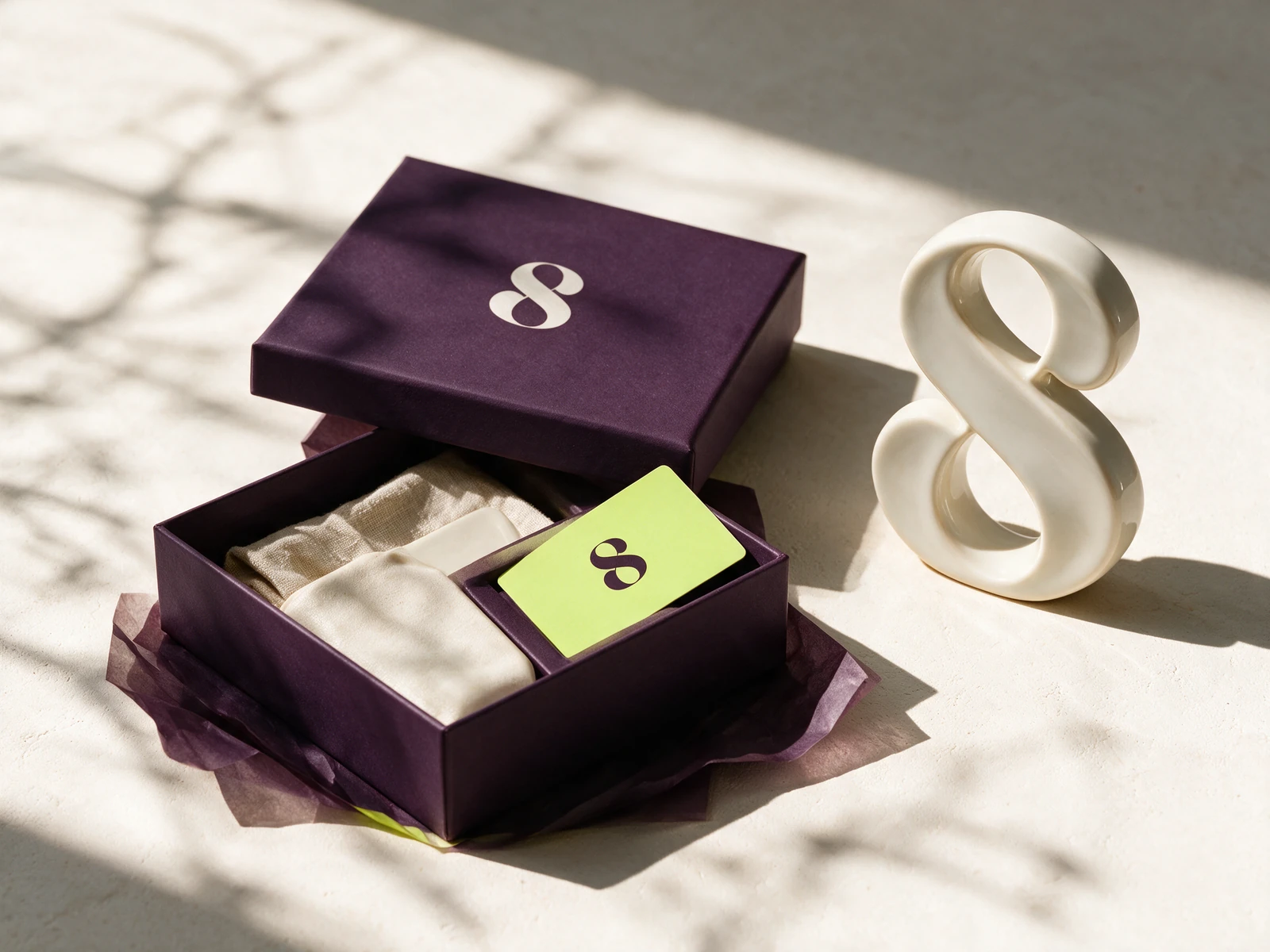
A fluid S reflects movement without performance pressure. Rich aubergine grounds the identity, while soft porcelain and an unexpected lime bring lightness. Expressive type meets an effortless booking experience.
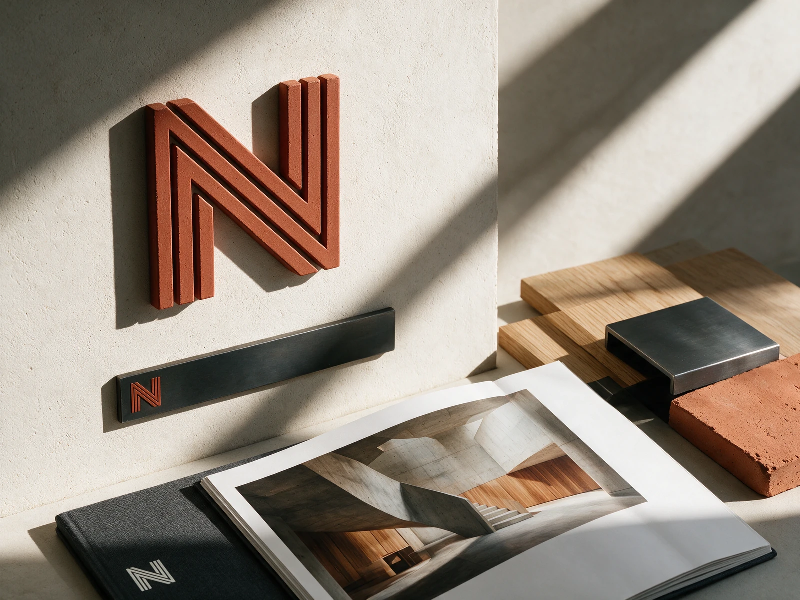
Parallel structural lines form an N, echoing the precision of an architectural drawing. A material palette of plaster, charcoal, and rust gives the system warmth; generous space lets the work speak.
Screens show the Measure Joy studio preview, separate from the live store. The case study identifies the delivered commerce scope; no performance uplift is claimed.